Brightidea's Initiative Dashboard allows administrators to view metrics associated within the selected Initiative. This article will review all components of the Dashboard and what information administrators should be aware of.
To access the Dashboard from the Pipeline, select Dashboard from the top menu:
Overall
Admins can configure which indicators to prioritize under Top Indicators in the Dashboard by selecting the gear icon:
Each indicator is a general overview of Idea metrics in Pipeline:
- Available Indicators
- Total Unique Logins: Count of unique user logins
- Participated: Number of unique users who have submitted, voted, or commented
- Submissions: Number of ideas submitted for all statuses
- Active Submissions: Count of active idea submissions
- Open Action Items: Count of open action items
- Permitted: Number of unique users who have Group access
- Interactions: Number of team submission and comment interactions
- Completed Action Items: Count of completed action items
- Hand - Offs: Count of ideas with a Hand-off status
- Projected Net Benefit: Total projected profits recorded in the pipeline
- Non-Financial Benefits: Count of Revenue, Savings, and Other Outcomes recorded
- Actual Benefits: Total Dollars of Revenue, Savings, and Other Outcomes recorded
- Oldest Active Idea: Age (in days) of the oldest Active Idea
- The next metric the administrator can view is Pipeline Activity.
- Note - An active idea is one that is mapped to the system status of "Active".
- Pipeline Activity displays data for the number of Active Ideas and Open Action Items:
- In Pipeline Activity the admin has the option to view activity over a specific period of time:
- Average Days Per Step displays the average amount of days that idea(s) have spent in a Pipeline step:
- Current Items Per Step displays the total number of ideas currently in a particular Pipeline step:
- Items Per Status displays a percentage of the amount of ideas in the selected Pipeline that belong to a specific status:
Engagement
- The Engagement Over Time dashboard consists of unique Participants and Visitors for your Initiative over the timeframe selected.
- Participants are Users who have contributed, commented, or voted on a submission. Visitors are Users who have accessed the site at least once.
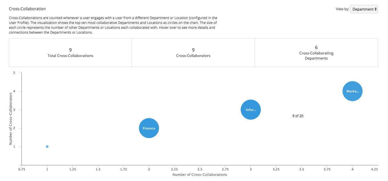
- In the Cross-Collaborations Dashboard Cross Collaborations are counted whenever a user engages with a user from a different Department or Location (configured in the User Profile).
- The visualization shows the top ten most collaborative Departments and Locations as circles on the chart.
- The size of each circle represents the number of other Departments or Locations each collaborated with.
- Hover over to see more details and connections between the Departments or Locations.
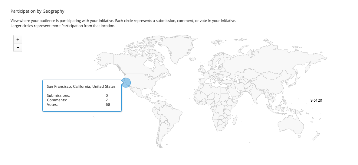
- In the Participation by Geography Dashboard you can view where your audience is participating with your Initiative.
- Each circle represents a submission, comment, or vote in your Initiative.
- Larger circles represent more Participation from that location.
-
Note: The location data in this map is based on users' IP addresses, not the location data in their profiles.
- IP address locations are not always 100% exact, so this map is an approximation of participants' locations.
Business Impact
- The Financial Benefits Over Time dashboard consists of actual and projected gross benefits recorded within the initiative over time.
- Financial benefits can be viewed cumulatively or yearly.
- To set financial targets, click on the gear icon in the top right:
- Business impact can also be exported by selecting the green Excel icon:
- In the Financial Summary by Innovation dashboard, financial impact is reported in the initiative by innovation.
- Administrators can see financial details for each innovation, including projected and actual costs and benefits.
Comments