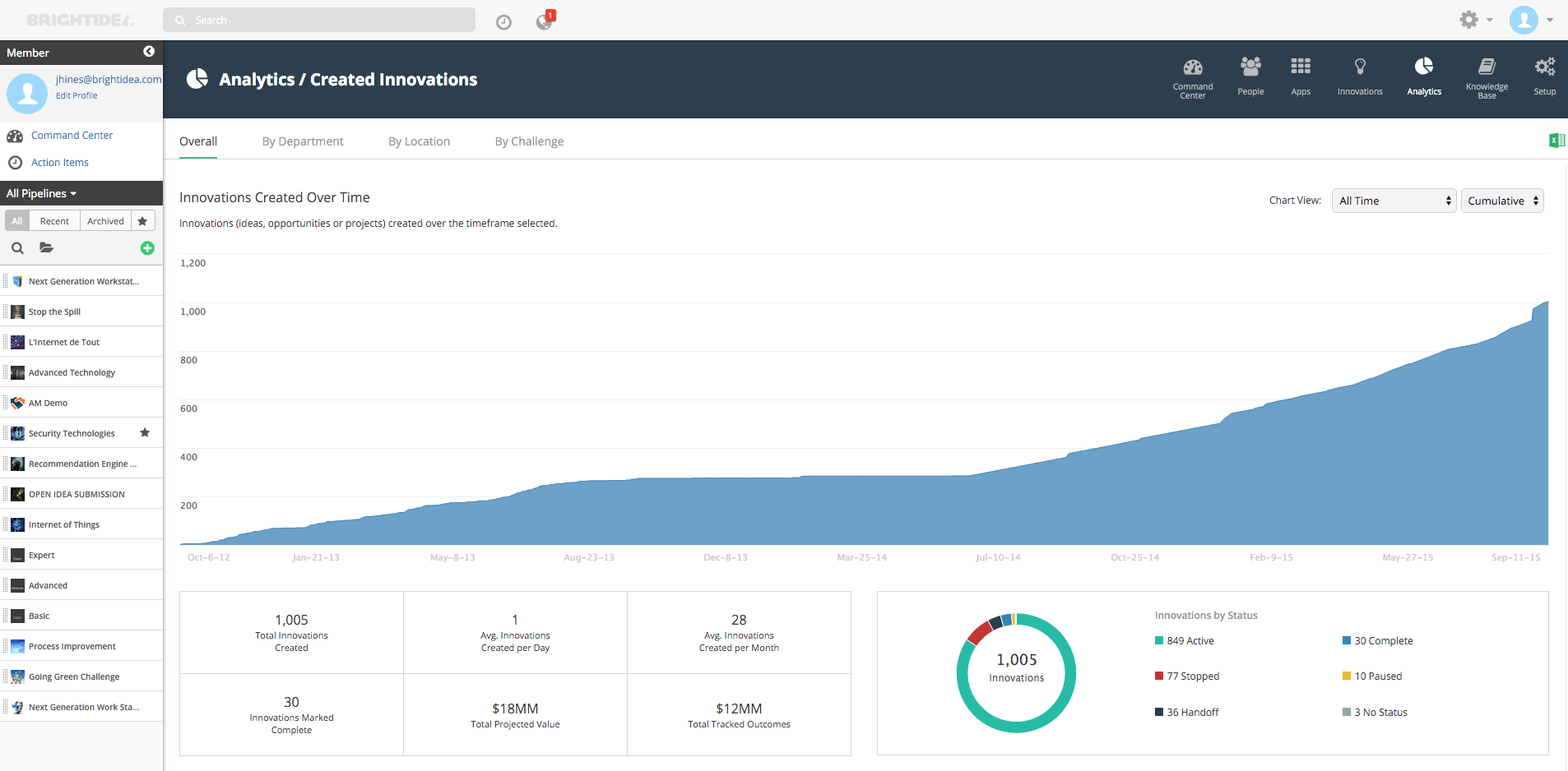
The Innovations Dashboard in the Command Center provides Innovation Program Managers with metrics about Innovations (ideas, opportunities or projects) created in their Brightidea system. This information can be easily shared with their executive team and enables them to take action in their system.
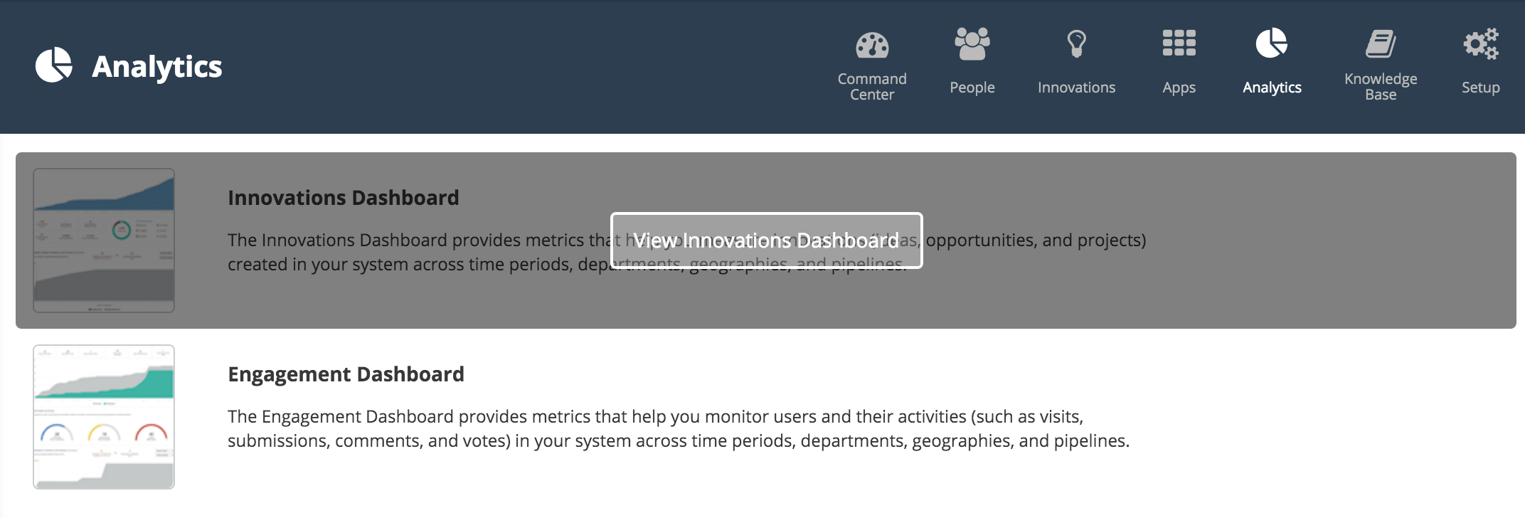
To access the Innovations Dashboard select the "Analytics" tab from the Command Center and then select "View Innovations Dashboard"
The IPM will then be redirected to the Innovations Dashboard
From the Innovations Dashboard page the IPM can access various reports through the "Overall", "Departments", "Locations", and "Challenges" tabs.
Overall Tab
By selecting the "Overall" tab the IPM can view data pertaining to all Created Innovations within their program.
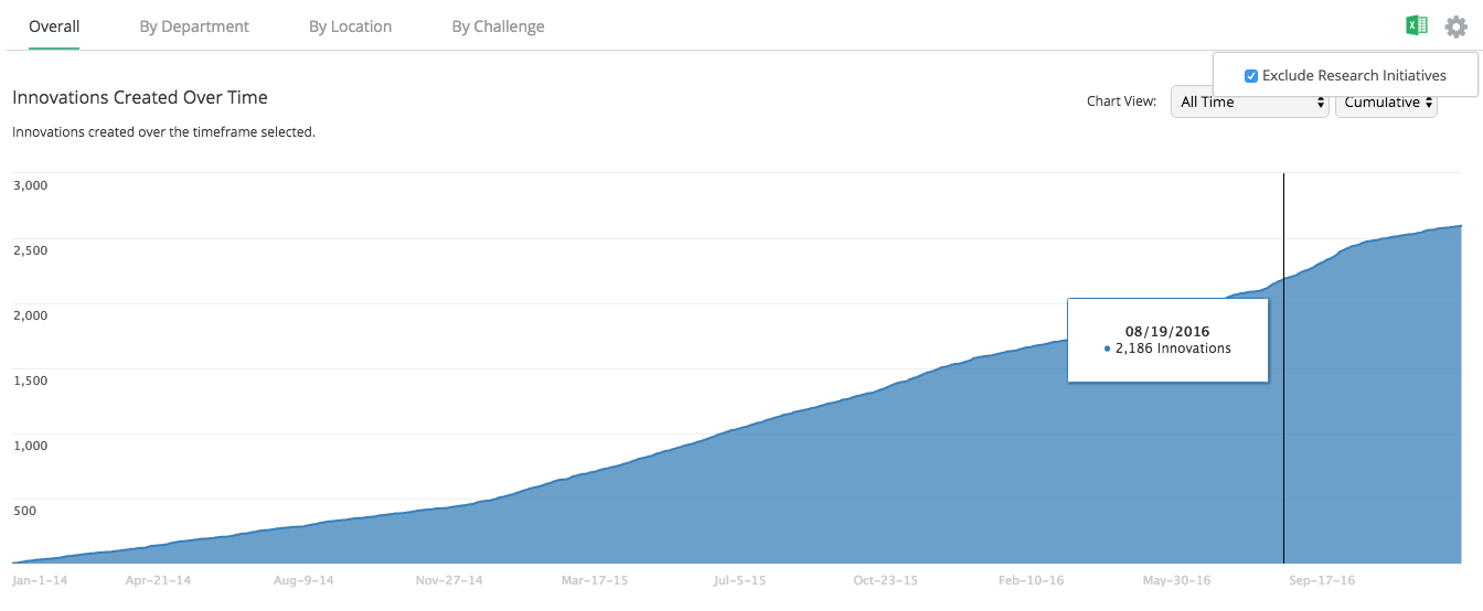
Innovations Created Over Time
This report displays Innovations (ideas, opportunities or projects) created over the timeframe selected.
The IPM can view total amount by date by hovering over chart.
Note: Pipelines marked Research Pipeline can be filtered out of the entire Innovations Dashboard by selecting the gear icon and checking off "Exclude Research Pipelines"
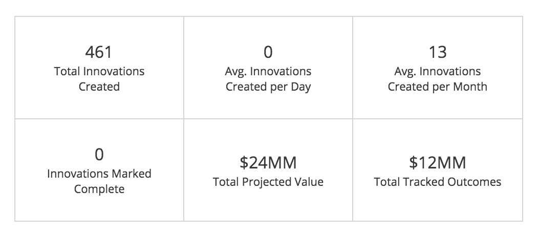
Recorded Metrics
This chart displays recorded metrics in the Innovations Dashboard
Metrics shown in chart area:
Total Innovations Created: Total number of innovations submitted within timeframe
Avg. Innovations Created Per Day: Average number of Innovations added per day
Avg. Innovations Created Per Month: Average number of Innovations added per month
Innovations Marked Complete: Total number of Innovations with a status of "Complete"
Total Projected Value: Total Projected Value (sum, of "Total Projected Profits")for innovations created in time period.
Total Tracked Outcomes: Total outcomes(dollar value; sum of all "Revenue" and "Cost Savings" recorded) associated with those innovations created.
Note: To learn more about Projections and Outcomes please reference this article on Projections and Outcomes.
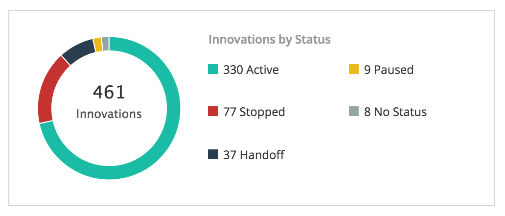
Innovations by Status
This chart displays the current System Status for the ideas created within the timeframe selected
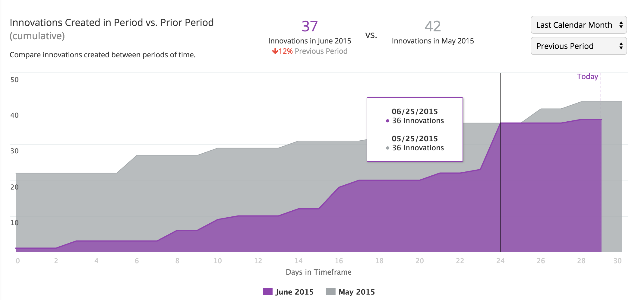
Innovations Created in Period vs. Prior Period
The chart allows the IPM to compare innovations created between the time period selected and with the previous time period
Department Tab
This tab is dependent on the configuration of Departments in the User Profile fields. If no Department data exists everything will be labeled "No Department." Please refer to the Brightidea Profiles article to learn how this is configured.
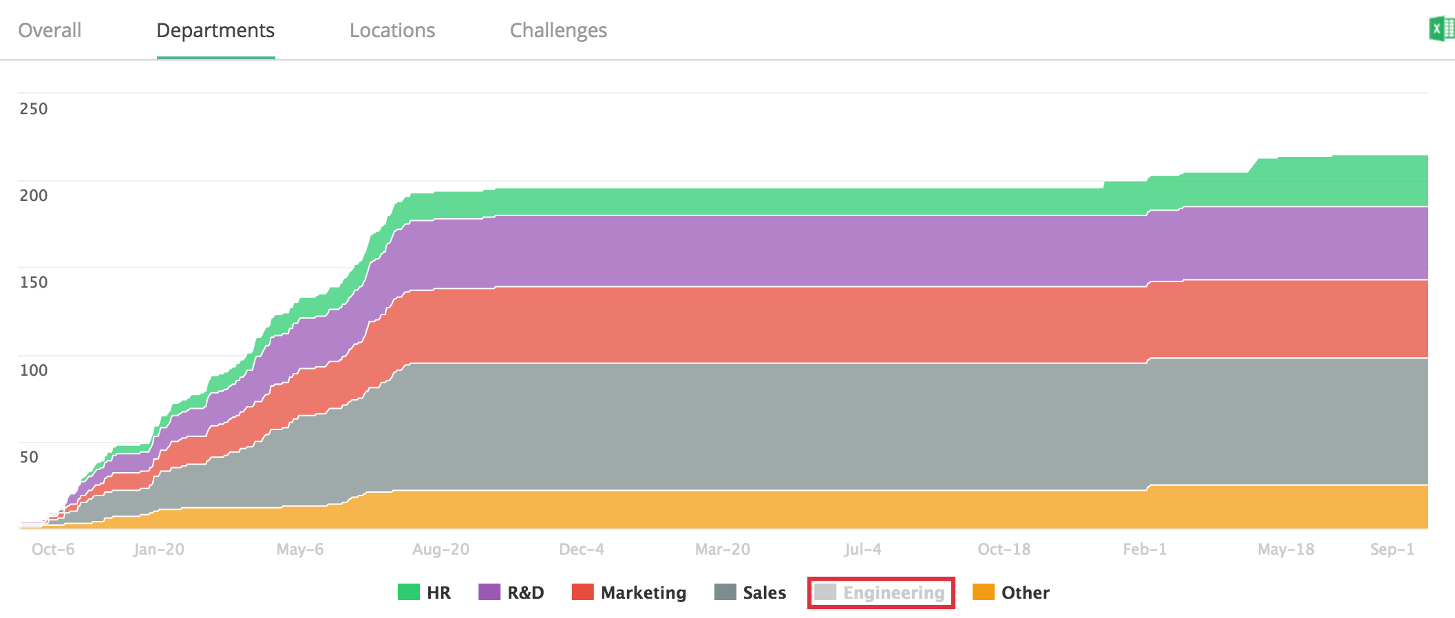
Created Innovations by Department (cumulative)
The top chart displays data for Innovations created over time by department within the timeframe selected.
The top 5 departments with the most innovations created are displayed. A sixth segment labeled "Other" combines all other department data into one
The IPM can click on a department to disable/enable it.
When disabling a department, the chart should reload the chart with the department excluded
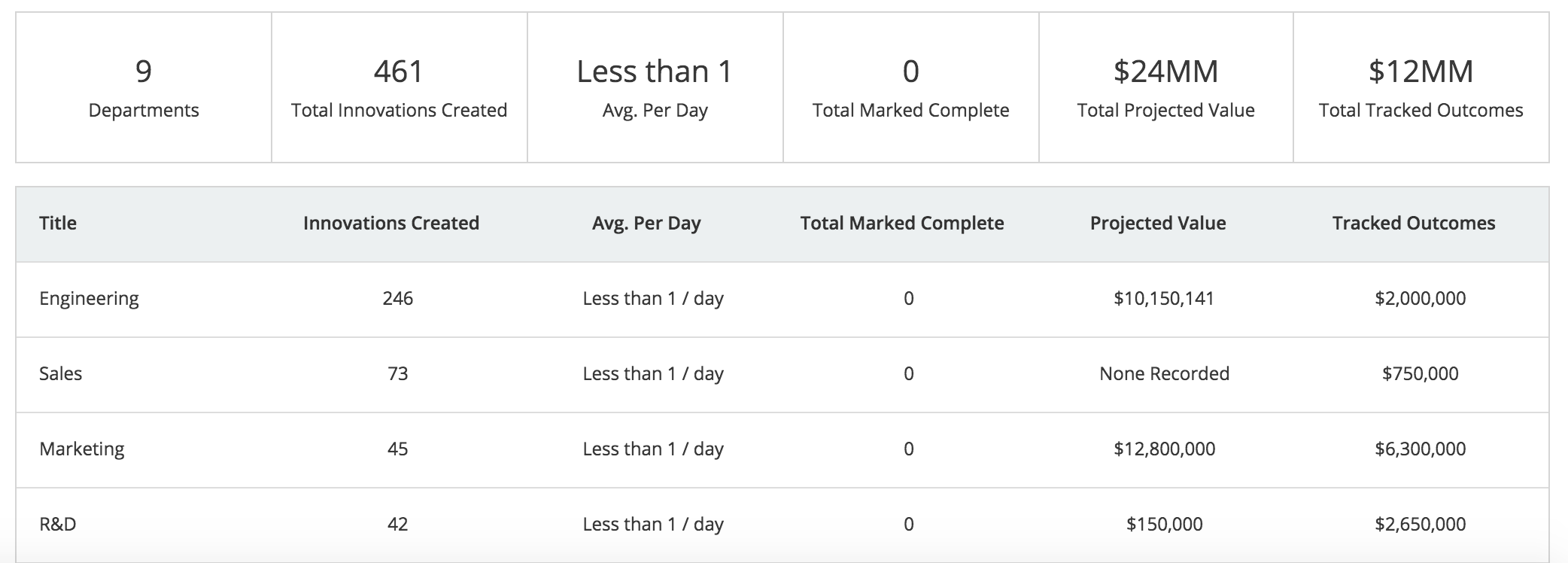
Innovations Summary by Department
Displays innovations by department sorted by total Innovations, Title, Ave. Per Day, Total Marked Complete, Projected Value, Tracked Outcomes, as well as search functionality.
Innovations added outside of the timeframe selected will be excluded.
Locations Tab
This tab is dependent on the configuration of Location in the User Profile fields. If no Location data exists everything will be labeled "No Location."
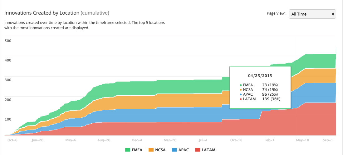
Innovations Created by Location (cumulative)
This chart displays Innovations created over time by location within the timeframe selected.
The top 5 locations with the most innovations created are displayed.
The IPM can click on a department to disable/enable it, same as the Departments chart
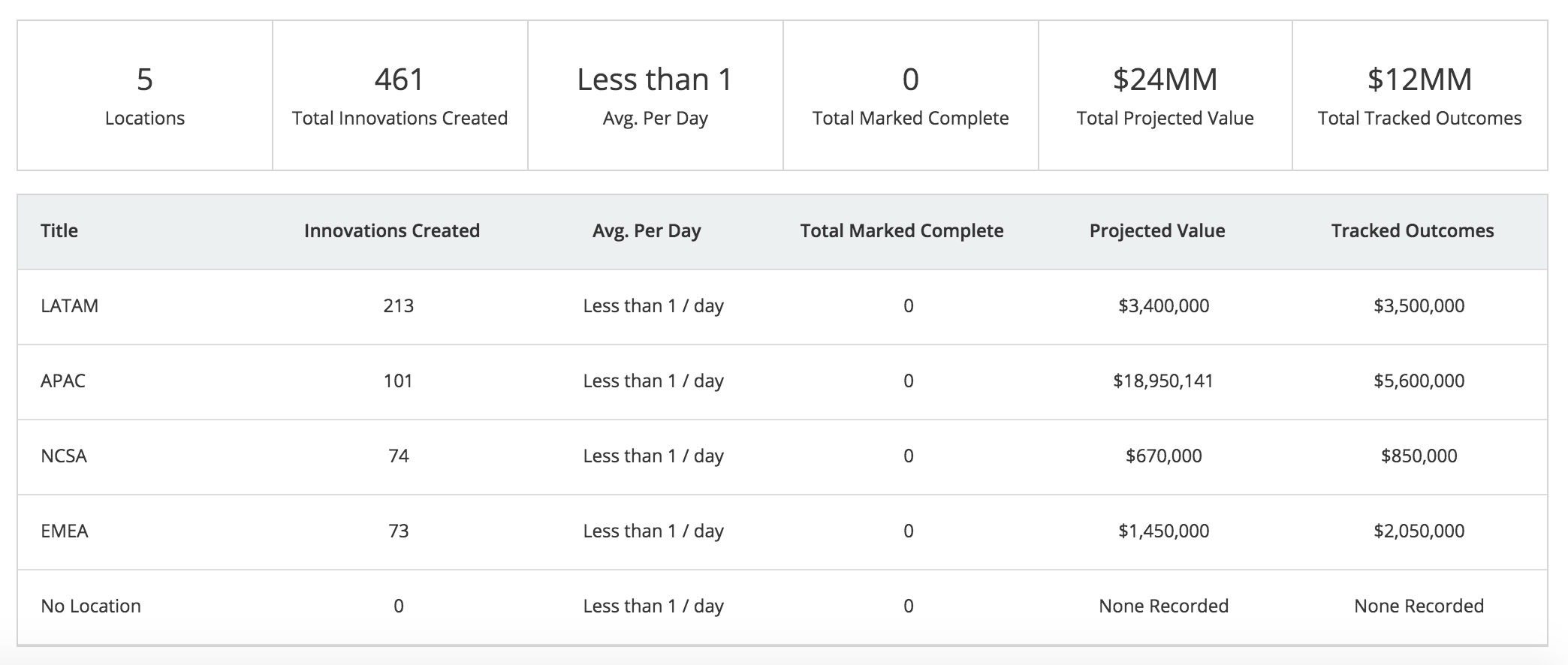
Innovations Summary By Location
This chart displays innovations by location sorted by total Innovations in descending order.
Innovations added outside of the timeframe selected have been excluded.
Challenges Tab
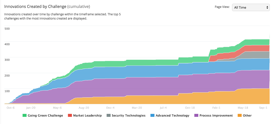
Innovations Created by Challenge (cumulative)
This chart displays innovations created over time by challenge within the timeframe selected.
The top 5 challenges with the most innovations created are displayed.
The IPM can click on a Challenge name to disable/enable it, same as the Departments chart
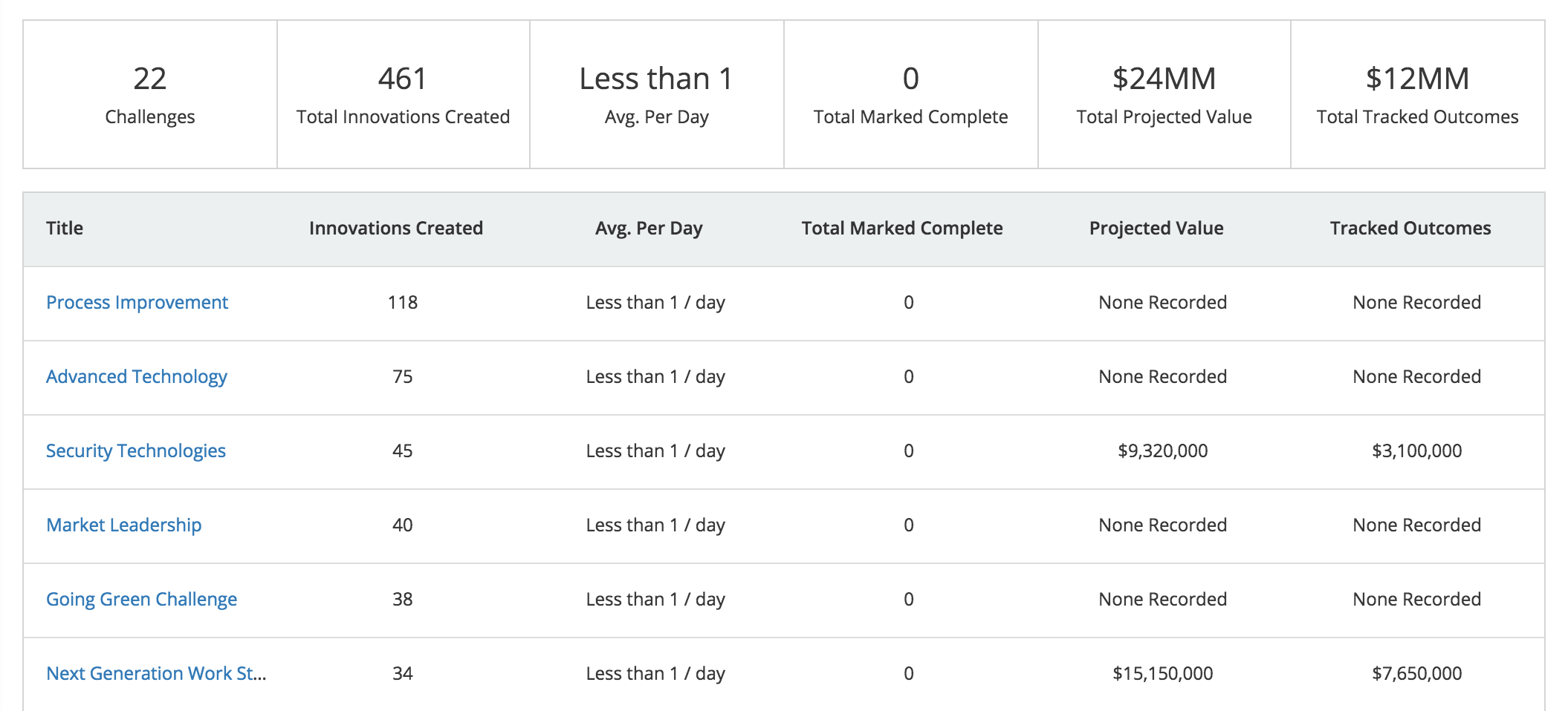
Innovations Summary by Challenge
This chart displays Innovations by challenge sorted by total Innovations in descending order.
Innovations added outside of the timeframe selected have been excluded.
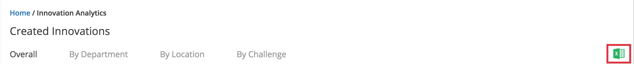
Reports
The Created Innovations report can be exported from the Innovations Dashboard
To view the report select the Excel icon
The Created Innovations report can be downloaded in a CSV file and gives a detailed list of all created innovations in the system
The report will reflect the data displayed in the "Overall" tab but can be filtered to see ideas by department, location, and challenge.
Note: The Challenge level report will display each row by challenge
Comments
Anthony Madama
Will the innovations dashboard always only show the top 5 challenges?

Will the innovations dashboard always only show the top 5 challenges?